Brand Identity Project
“I believe the choice to become a mother is the choice to become one of the greatest spiritual teachers there is.” – Oprah
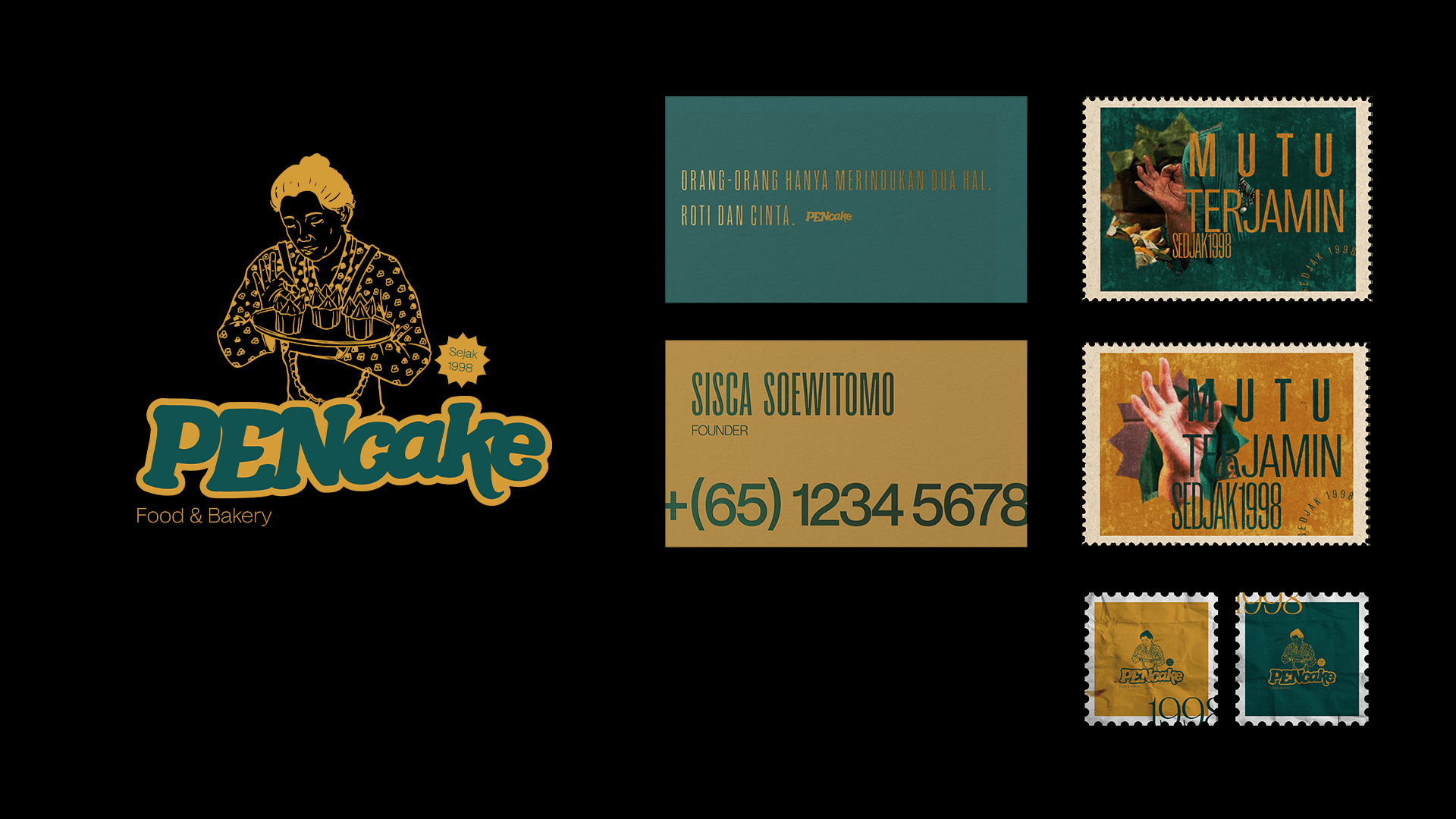
We got this story from one of the children of 3 siblings. His beautiful childhood was filled with the love and sweetness of her mother's cakes. The warmth of a mother's love can be the best medicine after experiencing days filled with dark clouds and gloomy hearts that are a burden every step of the way. 3 keywords inspire us in designing PENcake's identity, namely: love, memory, and Mother. From here, we get a good starting point for designing an identity.
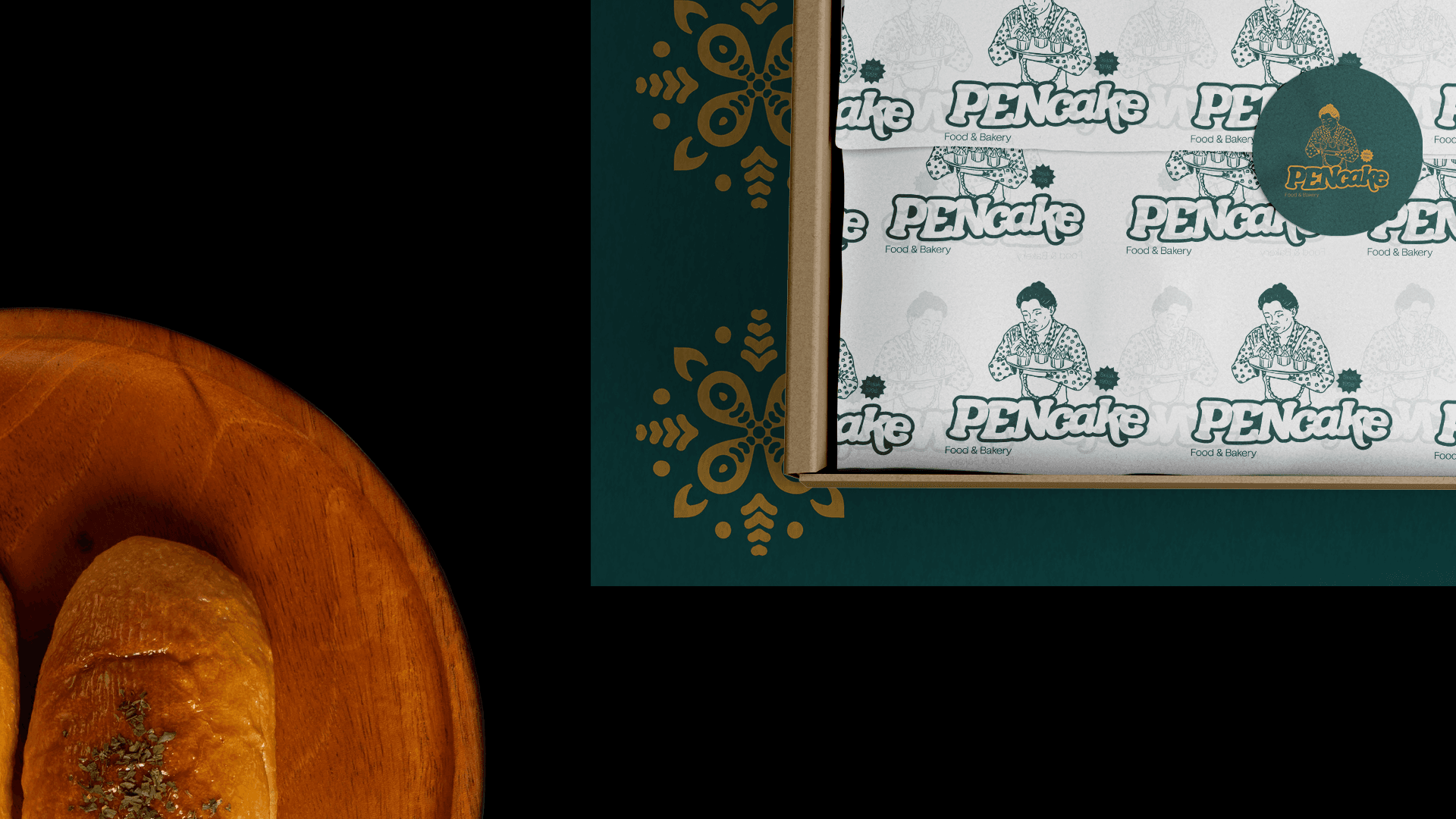
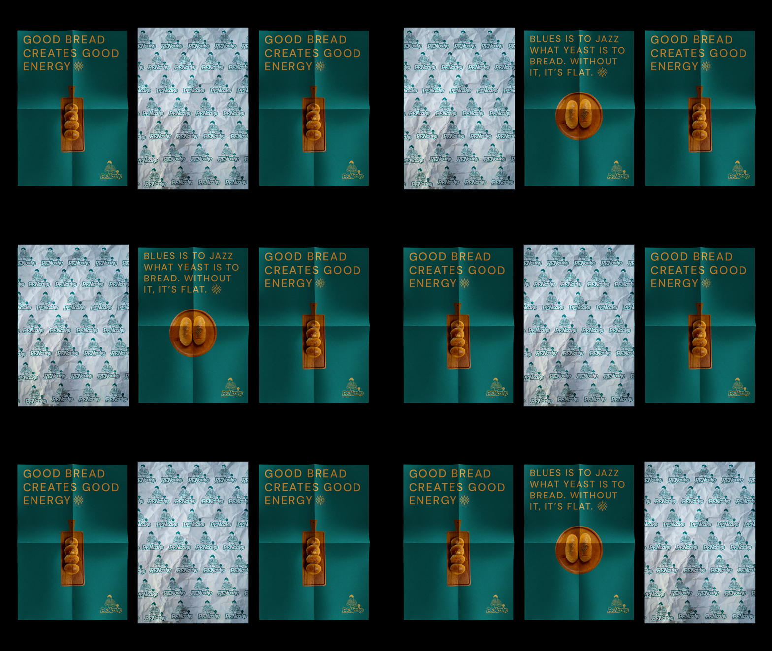
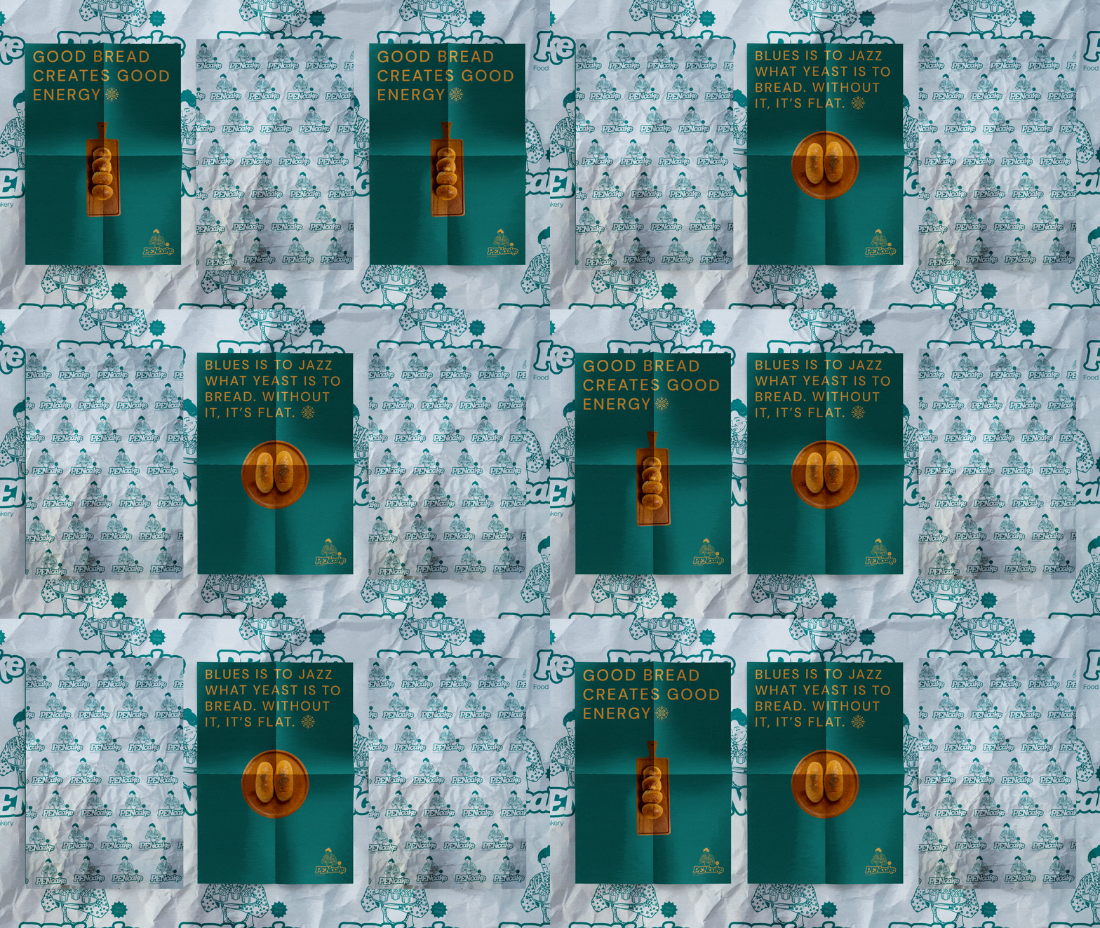
The choice of colours that have a personal meaning for the client is also a strong element in displaying a message and the impression of a beautiful childhood. In this case, PENcake's demographics are in line with the closeness and familiarity of the colour tones. What else? Oh yes, the mother figure who is the main identity in spreading the message of warmth and affection is also not left behind in our design. Various visual assets that represent PENcake such as batik, cupcakes, and gentle gestures become a universal visual language that can be understood by customers who are looking for nostalgia for homemade cakes.
