Branding Project
“Life isn't matter of milestones, but of moments” – Rose Kennedy
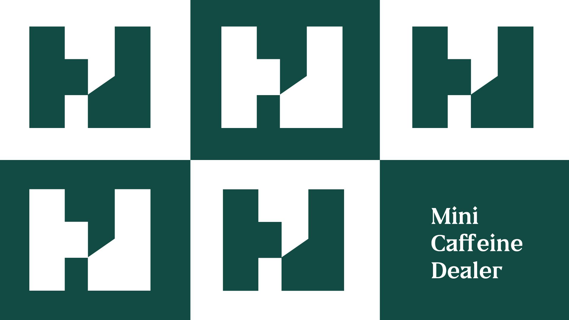
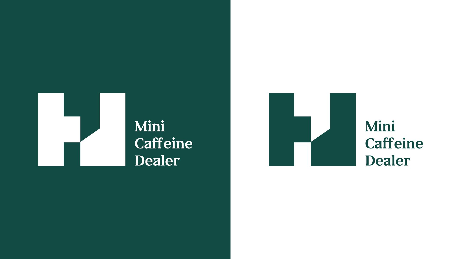
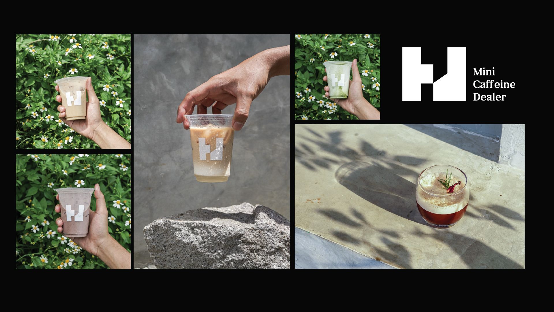
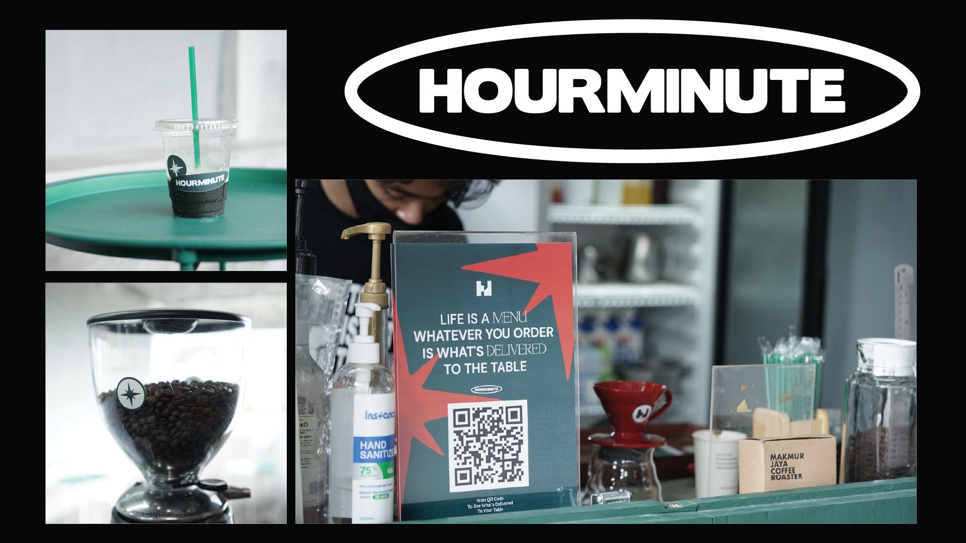
Hourminute; enjoy the moment every hour, every minute. It is not only a beautiful meaning, but this philosophy is one of the solutions in the midst of a world full of disruption. When the world has its craze, Hourminute emerges as a place to share moments and moments that can be cherished by those in it. Therefore, we made this way of living as a starting point in creating a solid image for Hourminute. Starting with the structure of the building that uses Brutalist style, simplicity meets imperfection which teaches us to accept it as it is; Wabi Sabi. The geometrical shape is our way to communicate a solid message of togetherness, coupled with a solid colour note—accepting the environment around you—this is one of the ways that Hourminute adopted to become one with the message they want to communicate with customers. The use of minimal properties also helps to build an image that is not excessive and balanced to be acceptable in a sufficient amount of visual burden.
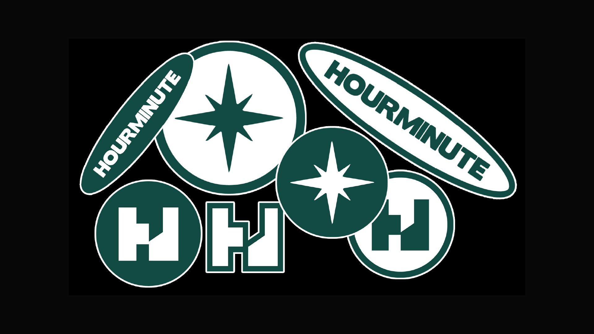
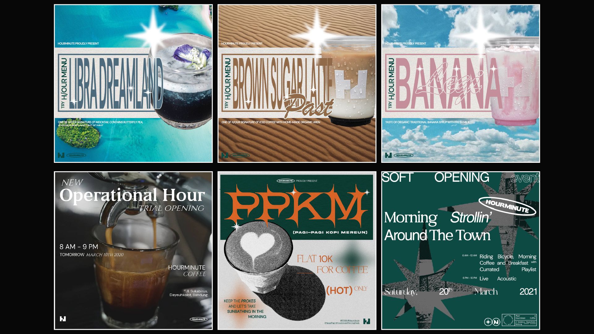
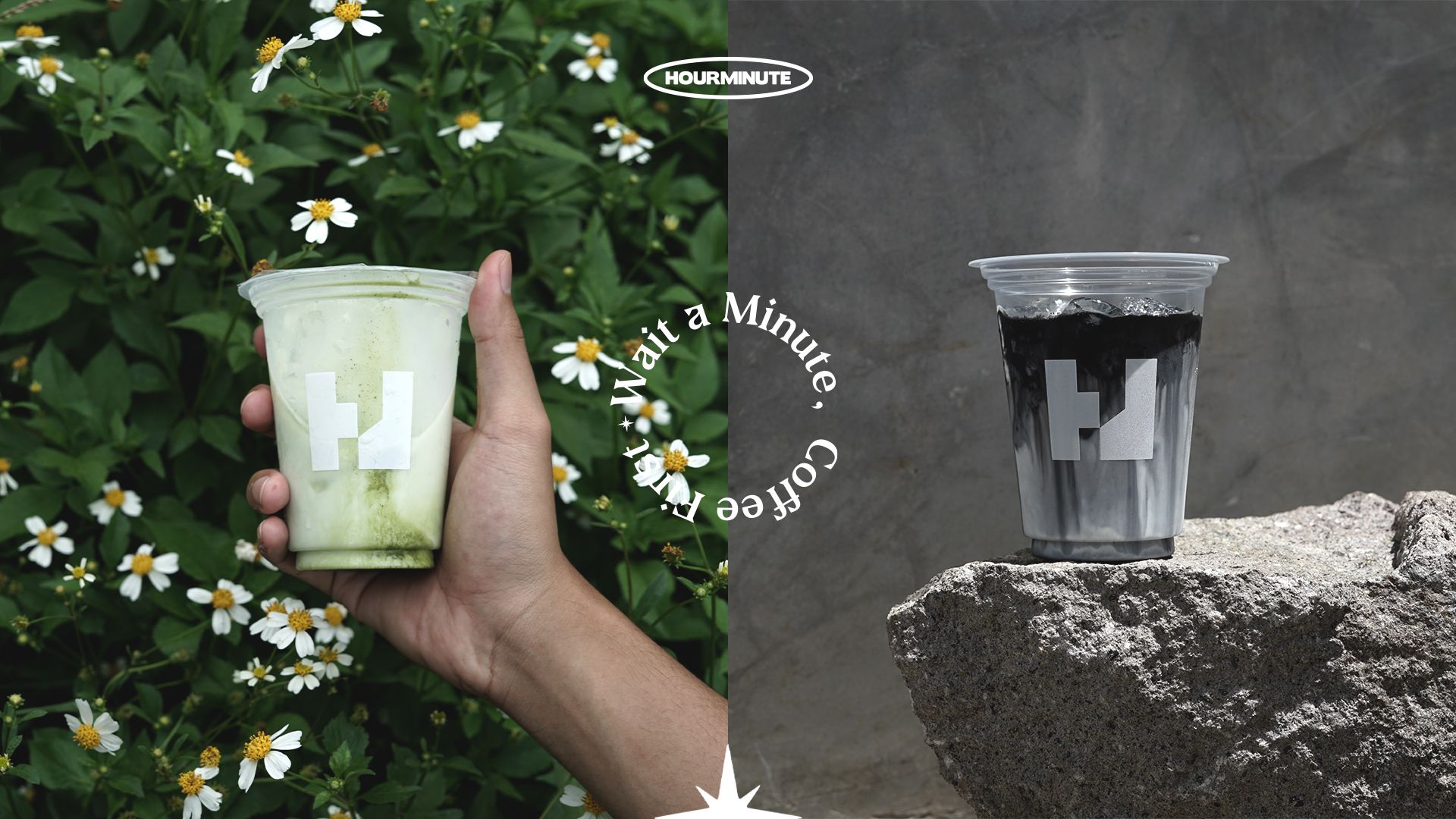
When we talk about branding, the design name is also included in our work to create a solid image. The naming of Hourminute's products is designed in such a way as to build a whole vibe so that customers can guess in their imagination about the possible flavours that come with each product. However, this time we want to include elements of the design trend that is busy among Gen Z, with a compulsive design feel and away from standard designs that tend to be neat and flat. Of course, the visualization decision taken also takes into account the demographics that surround Hourminute's place of business, with the majority of them being young and living as students, Hourminute can be a representative voice about hidden culture and youthful enthusiasm to stay alive in a disruptive world.
